Over the past few months, I have worked with two remarkably gifted individuals, Grant Sanderson and Sridhar Ramesh, on creating high-quality animated videos on mathematics for the YouTube channel 3Blue1Brown. It has been the experience of a lifetime, both expanding and strengthening my (often contrarian) views on math education. At the same time, it has taught me a lot of technical skills for creative expression in ways I would never have dared imagine in the past.
After three successful videos, this collaborative effort has recently come to an end, as Grant has decided to scale his channel back to a solo project. You can read about his reasons for this step on his Patreon. I wish him the best of luck for the future of the channel (which has just recently crossed 1M subscribers!). Its quality in both form and content has raised the bar for online educational content of any field.
What does the future hold for me now?
Over the past few years, it has become increasingly clear that video's role as a powerful new medium for education is firmly established, and is in the midst of replacing the traditional textbook as students' learning resource of choice. Looking at most textbooks, I say: good riddance. Well-made videos are so much more effective at conveying certain sorts of content than the written word. Even though of course, they can never replace the genuine human connection with a caring teacher, educational videos are here to stay.
But in recent months, and already when I had just started producing 3Blue1Brown videos, I've become increasingly conscious of the medium's limitations. Explanatory videos climb only two of the three rungs on (what I like to call) the Ladder of Engaging Content:
- Make it visual.
- Make it dynamic.
- Make it interactive.
Don't you kind of want to touch the mathematical objects in 3Blue1Brown's videos, reach into the screen? Play with them yourself, create your own? Then you are yearning for what Michael Nielsen calls an explorable medium for mathematics.
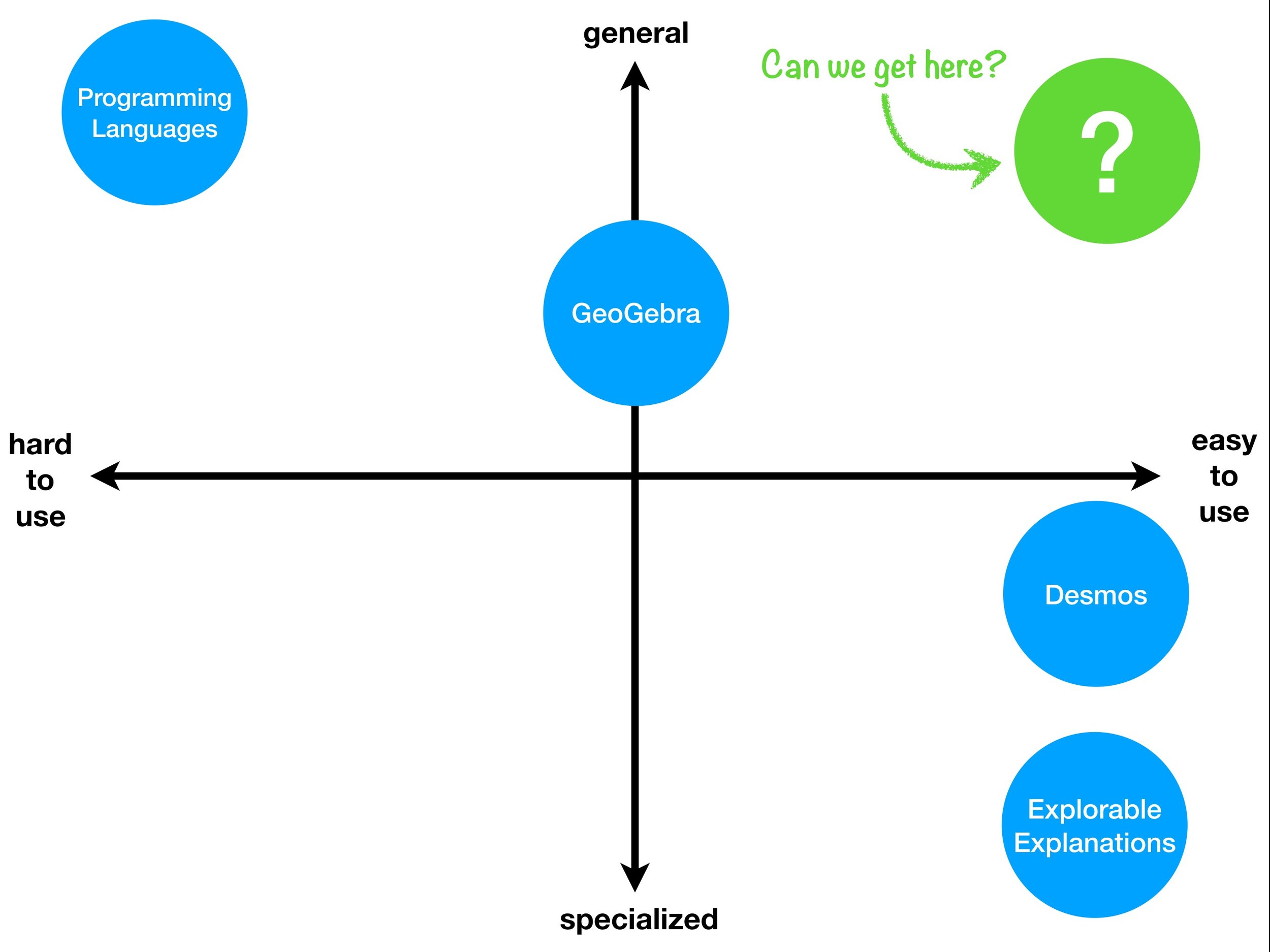
The idea is not new, in fact, parts of it can be traced back to the dawn of graphical user interfaces themselves. My own interest is fueled mainly by the mixture of delight and frustration that both GeoGebra and Desmos – in different ways – instill in me. Both apps illustrate a trade-off that appears to exist between power and usability.
As GeoGebra became more powerful over the years, its ease-of-use has greatly suffered. Many of my students had felt overwhelmed by the visual complexity of the early-2000s interface. (Truth be told, GeoGebra's latest versions have started to declutter the UI.)
Desmos, on the other hand, was designed from Day One for users of the mobile age. No menus, no tooltips, no tiny icons. Just touch your function! To keep that feeling of immediacy, the Desmos team treads very lightly when adding features. The price for this is that Desmos remains a graphical calculator – no less, but also no more. And still, it gives many of its users so much delight that their creative spark pushes against its boundaries!
The trade-off between power and usability seems to be unsurmountable. And yet, in recent years, a number of voices have started to question that premise. Ken Perlin's ChalkTalk and Michael Nielsen's Magic Paper are prototypes pointing in the right direction, as is this talk by ever far-out Bret Victor. Is the trade-off really a law of nature, or merely a self-fulfilling prophecy? Apps such as GeoGebra and Desmos have, each in their times, redefined what people believed possible in math-ed software. Who says we can't make that happen again?
Similarities with this are absolutely intentional.


